Module: Graph 1D Object
Creates a graph of 1D data and outputs as a geometry object - useful for line slices of higher dimensional data
| input port | type | description | data acceptors |
|---|---|---|---|
| inField | VNField |
| output port | type | description | data schemas |
|---|---|---|---|
| outObj | VNGeometryObject | complete animated geometry |
Description
The graph 1D object module creates a graph geometry object of all 1D scalars of the input field.
Input data
The input field is a regular 1D field.
Output data
The output is a geometry object for 3D rendered volume.
Presentation parameters
In the Data tab the user defines the Argument axis of the graph, which can be the variable
index or one of the scalar variables. The argument range is defined in a slider.
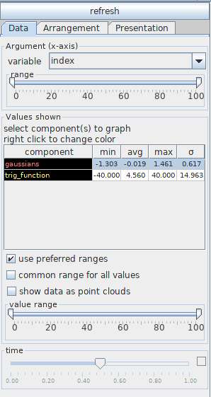
The component table contains information about all components of the input field: component names, minimum, maximum, average value and deviation. If the component is a vector field the table contains information about the vector length.
Mouse click at a row switches on/off the graphical presentation of the component. The user can choose more than one component using the ctrl/shift button.
Right mouse click at the component row raises a color panel from which the user can choose a new color by a next mouse click, the line width and the stroke of the line as continuous, dashed, dotted, dash-dotted, dot-dash-dot or dash-dash-dot. The background color in the component column reflects the background color in the viewer window.
The option use preferred ranges means that the user defined preferred range is used, otherwise the real minimum/maximum values of the components are used. This option is switched on by default.
If the common range for all values option is switched on, graphs of components with very different ranges are multiplied by appropriate factors in such a way that all graphs can be well recognized. In this case there appears information in the legend about the multiplication factor. By default, this option is switched off.
If the show data as point cloud option is switched on all data is dotted. By default this option is switched off
The value range slider allows one to choose an appropriate percentage of value ranges, and in case of time dependent data the time slider defines the time step, which is presented in the graph. Data in between time steps are interpolated.
The Arrangement tab defines position and size of the graph.
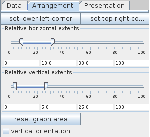
Click the set lower left corner button and following this click the left mouse button at the place in the viewer where the lower left corner of the graph should be positioned in order to position the graph. This works only if there is enough space left for the graph.
Click the set top right corner button and then click the left mouse button at the place in the viewer where the top right corner of the graph should be positioned for scaling the graph. This will work only if the clicked point is on the right side and above the actually defined lower left corner and if there is enough space left for the graph.
Position and size of the graph can be adjusted using the Relative horizontal extents slider and the Relative vertical extents slider, or the input fields below the sliders. Parameters are given in percent of the graphics window extent.
Press the reset graph area button in order to use default area parameters.
The user can change the orientation of the graph by switching on the vertical orientation option.
The Presentation tab defines other features of the graph.
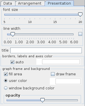
The font size slider changes the size of labeling fonts, i.e. title, numbers and variable names displayed in the graph.
The line width slider selects the width of lines or points of the axes. If the check box on the right hand side is on the user can change minimum, maximum and current value typing the values into text fields.
The title text field allows to give the graph a title.
The borders, labels and axes color can be defined if the auto option is switched off. Then a right mouse click at the color slider raises a color panel from which the user can choose a new color by a next mouse click. By default, the auto option is switched on.
The background color is the background color of the 1D graph. It’s color can be changed if the user switches the user color option and the fill area option on. By default the window background color is used. The opacity of the graph background area can be changed by dragging the opacity button into the left/right.
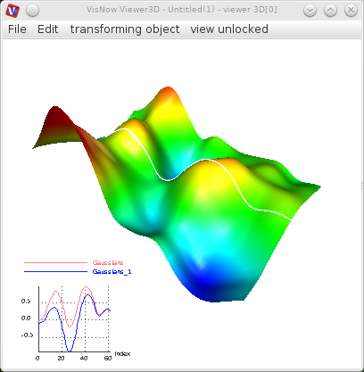
Example
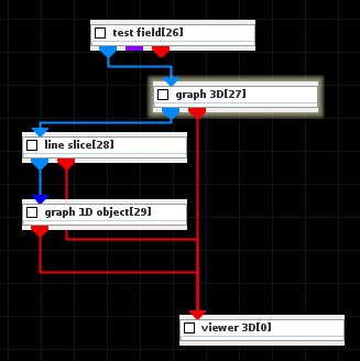
Choose the test field module from test objects library and graph 3D and line slice modules from 2D field mappers library and graph 1D object module from 1D field mappers library and connect the modules.
In the test field choose 2D and Gaussians and Gaussians_1. In the line slice module UI choose an appropriate line which will be presented as a graph, in the modules GUI choose the mapping component null and white color.
Click the right mouse button at the Viewer 3D window to raise the controls window and choose white background color and minimize orientation glyph size. Then go back to the graph 1D object module UI and define appropriate graph position, font size and graph line width. You may choose more components from the input field which will be presented in the graph.